
Context
Klīversala Quarter was already taking shape when Pro Kapital launched a tender to redefine its brand. Conceived as a vibrant mixed-use neighborhood, the development was designed to bring together residential buildings, cafés, restaurants and generous public spaces—creating a place to live, meet and spend time by the waterfront, for people of all ages.
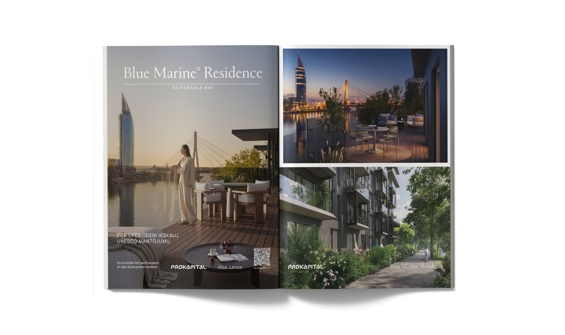
By then, two major phases of the development were already in place: River Breeze Residence had been completed, while Blue Marine was nearing completion.
Yet the quarter itself still lacked a clear identity that could bring the entire destination together and express what made it truly distinctive.
It needed more than a visual refresh. It called for a complete rethinking of the brand: a sharper positioning, a new name and a distinctive visual language capable of giving the quarter a strong, memorable presence—and communicating the unique character of the place with confidence.
Naming
Research into the history of Klīversala revealed something essential: this was never simply a waterfront location. Water has always shaped life here.
Over the centuries, the peninsula played an important role in Riga’s maritime life. It served as a hub for cargo handling, mooring and ship maintenance. Klīversala also housed the Sailors’ Home and the Riga Yacht Club.
This history provided a clear direction. Rather than treating the maritime character of the place as something belonging to the past, it became an integral part of the quarter’s contemporary positioning and identity—carried forward in a subtle, sophisticated way.
That thinking gradually led to a new, concise name: Kliversala Bay.
The name is both a nod to the area’s heritage and a reflection of life today: a place shaped by the river, where the city opens up to water. At the same time, Bay suggests something more intimate—a sense of community, life and activity within a setting that feels naturally sheltered from the noise of the city beyond.


Positioning
Kliversala Bay is a rare residential setting where the energy of central Riga meets the openness of life by the river.
Here, water becomes part of the everyday experience—bringing more light, greater perspective and a sense of calm, while the city remains close at hand.
The result is a distinctive balance of urban proximity and natural openness: a place defined not only by its beauty, but by the enduring quality of the way it feels to live here.
Logotype
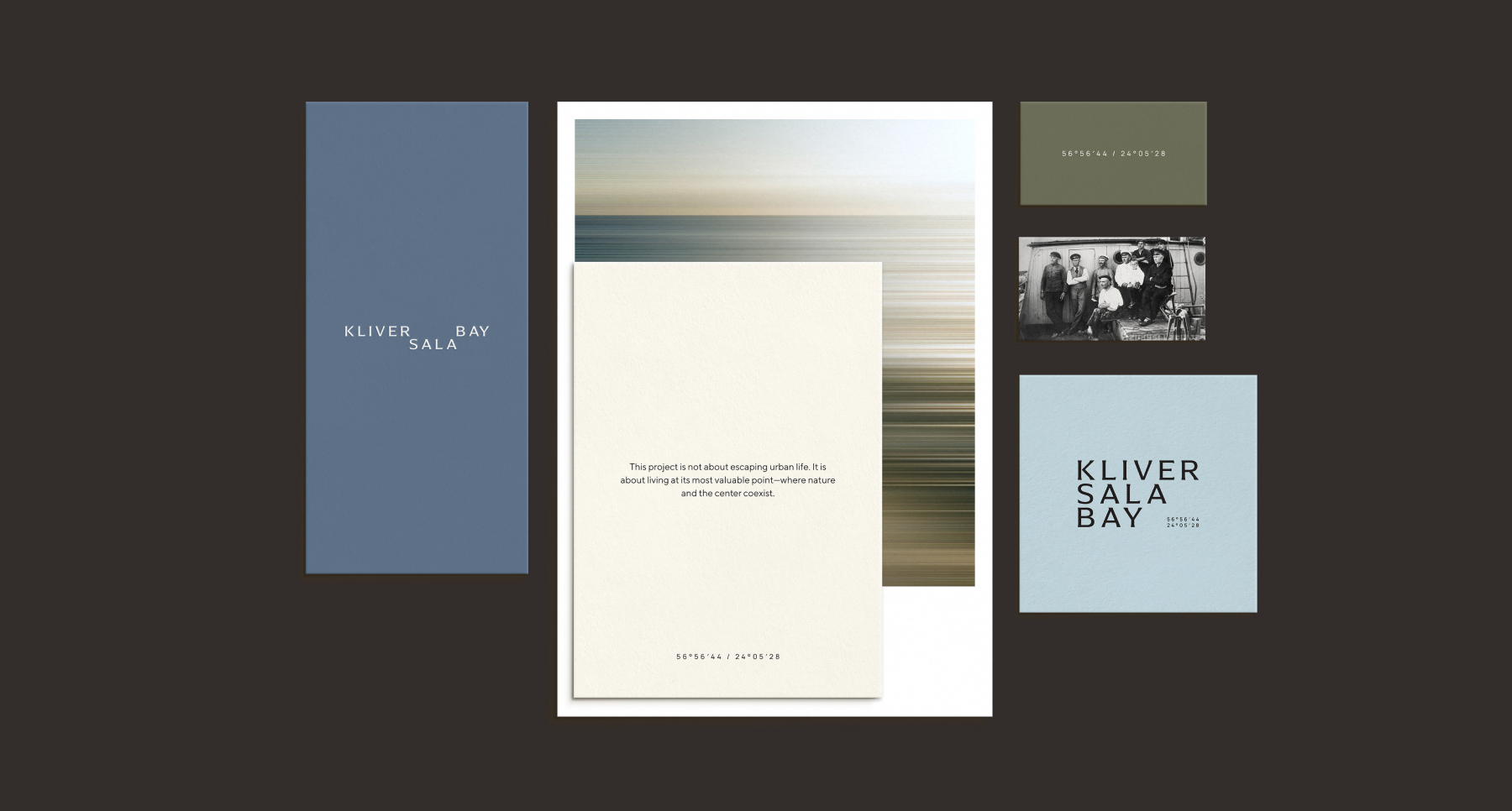
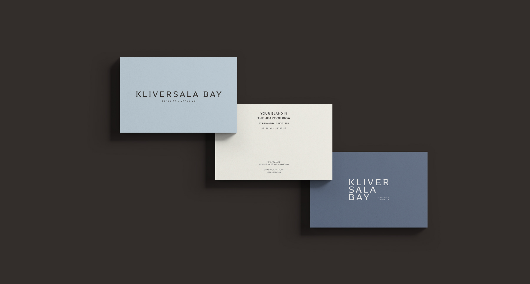
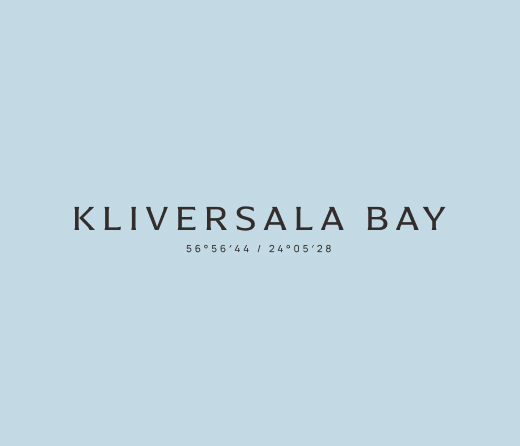
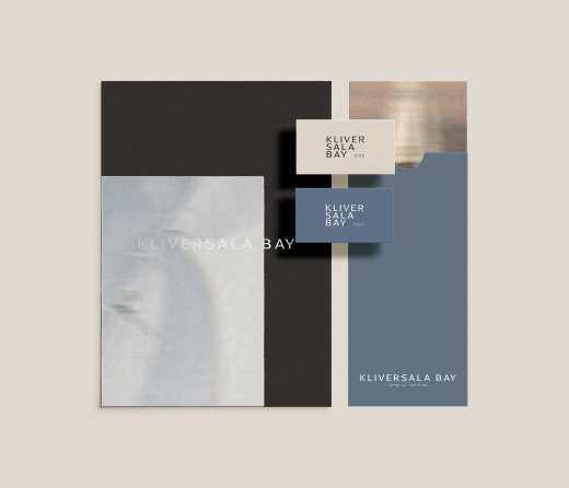
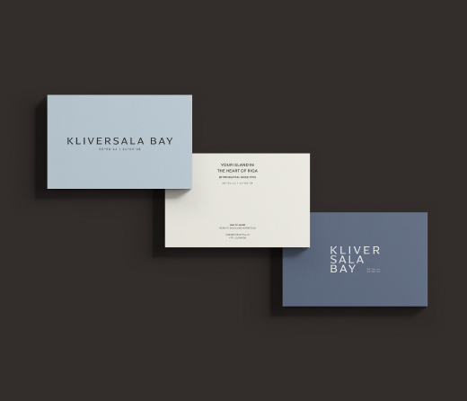
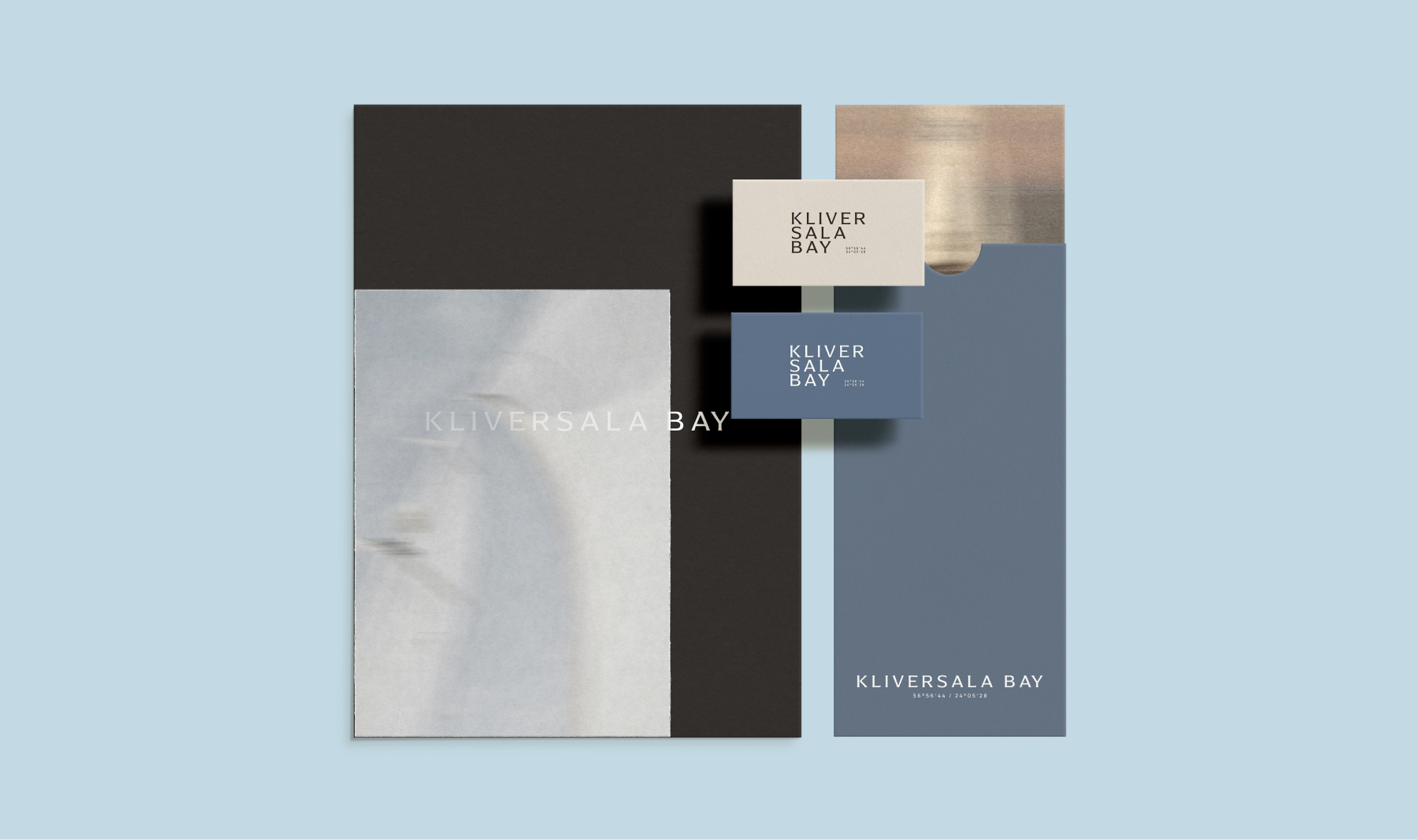
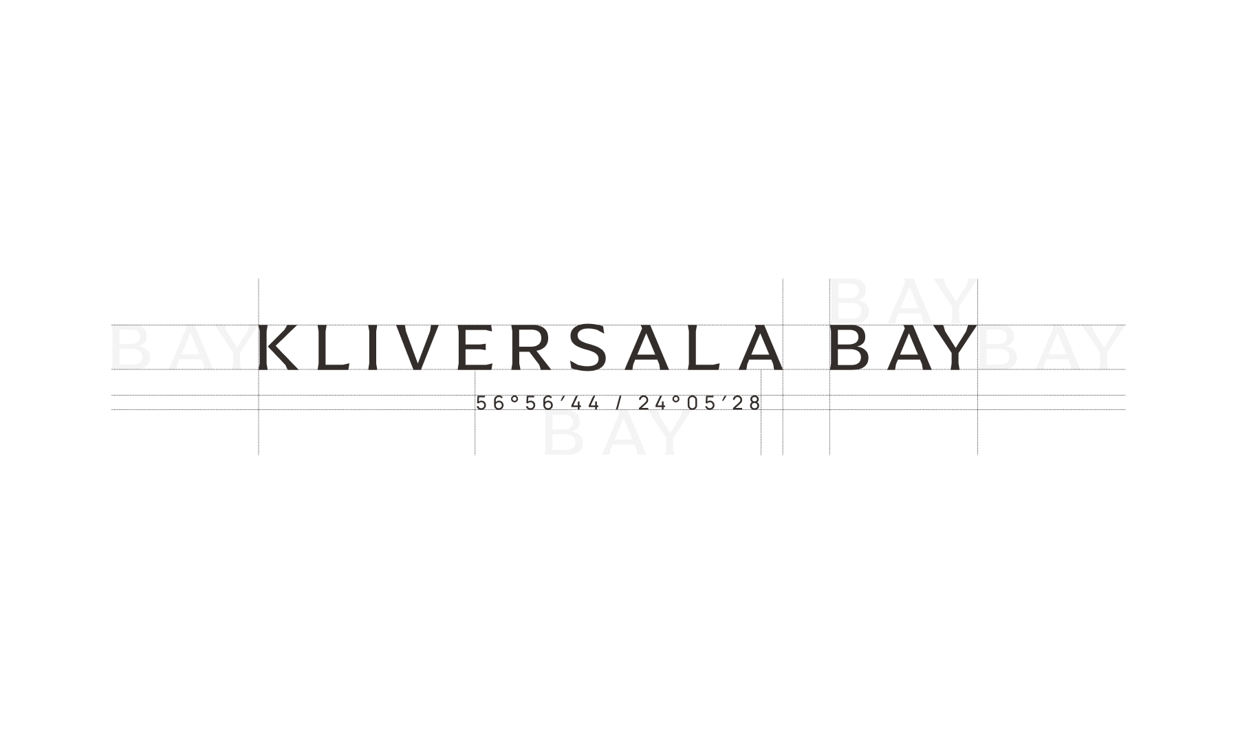
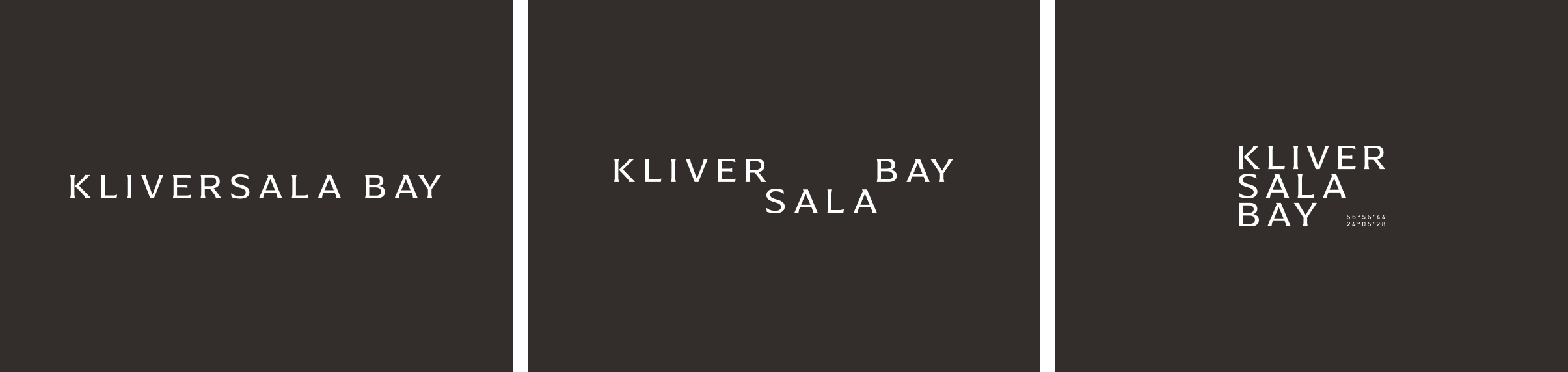
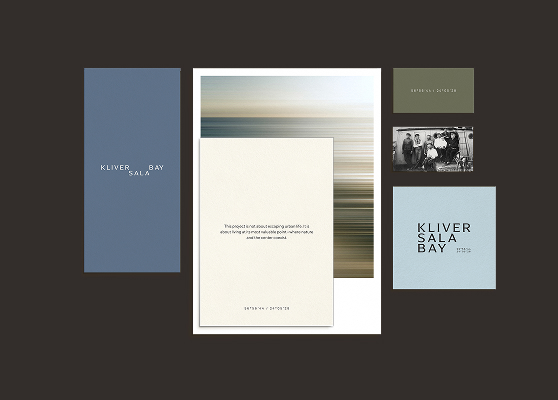
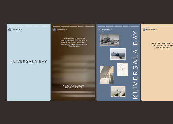
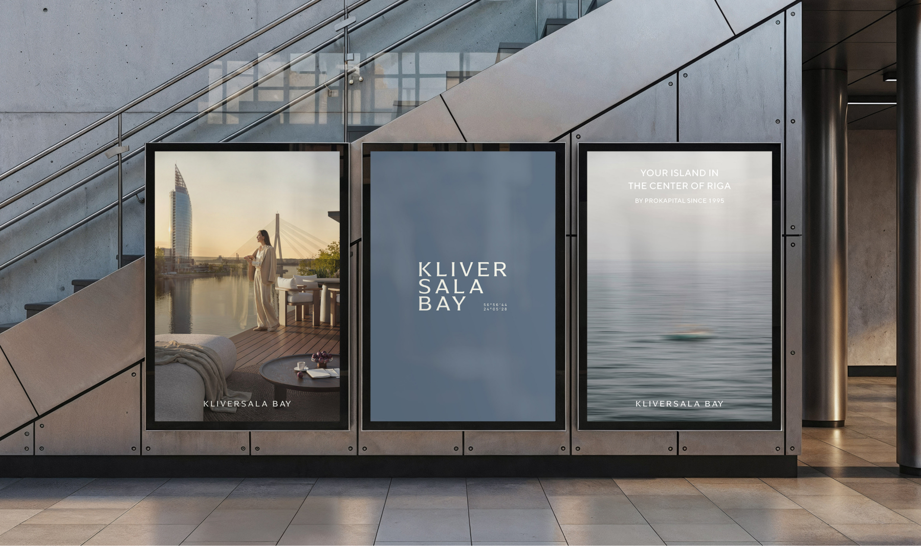
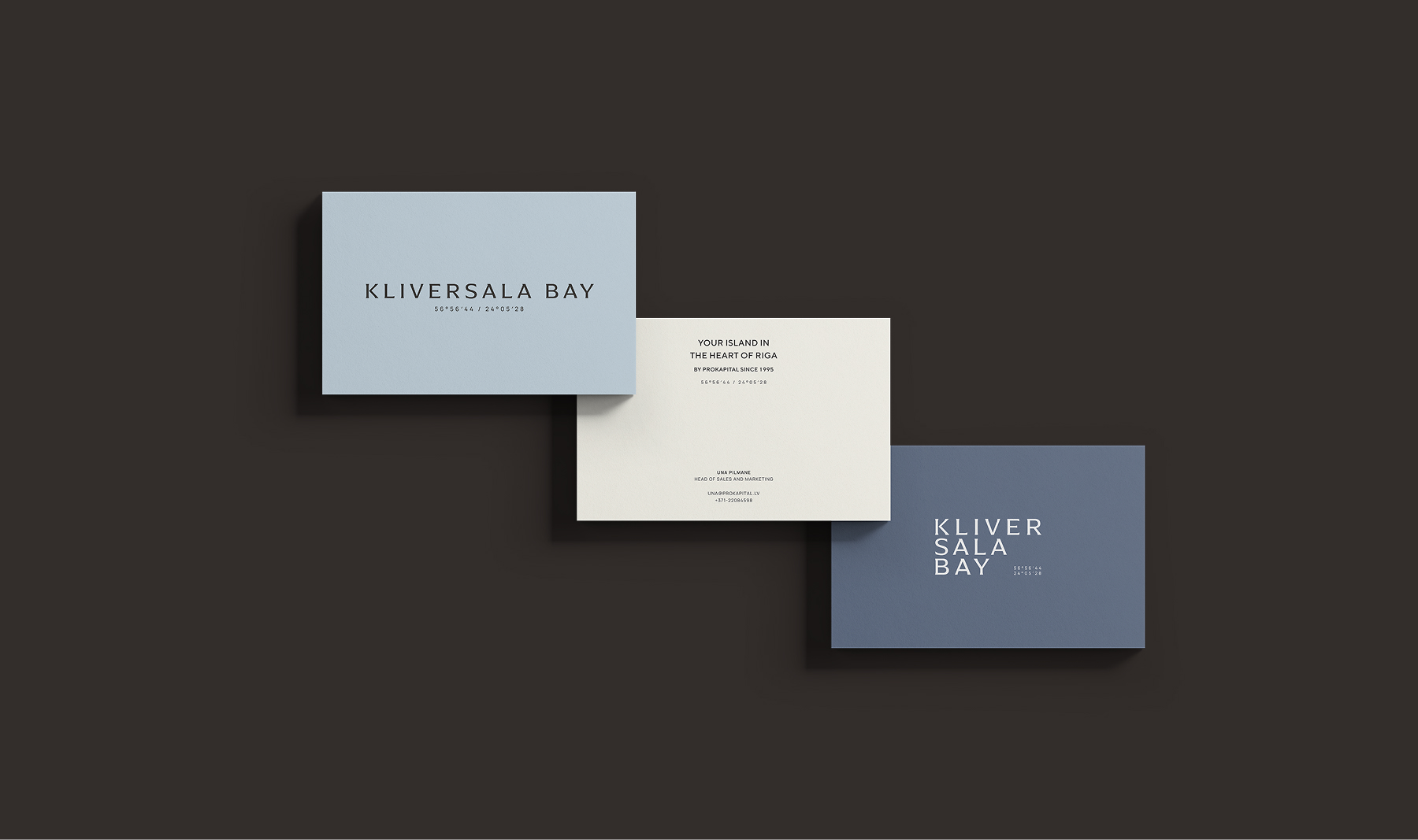
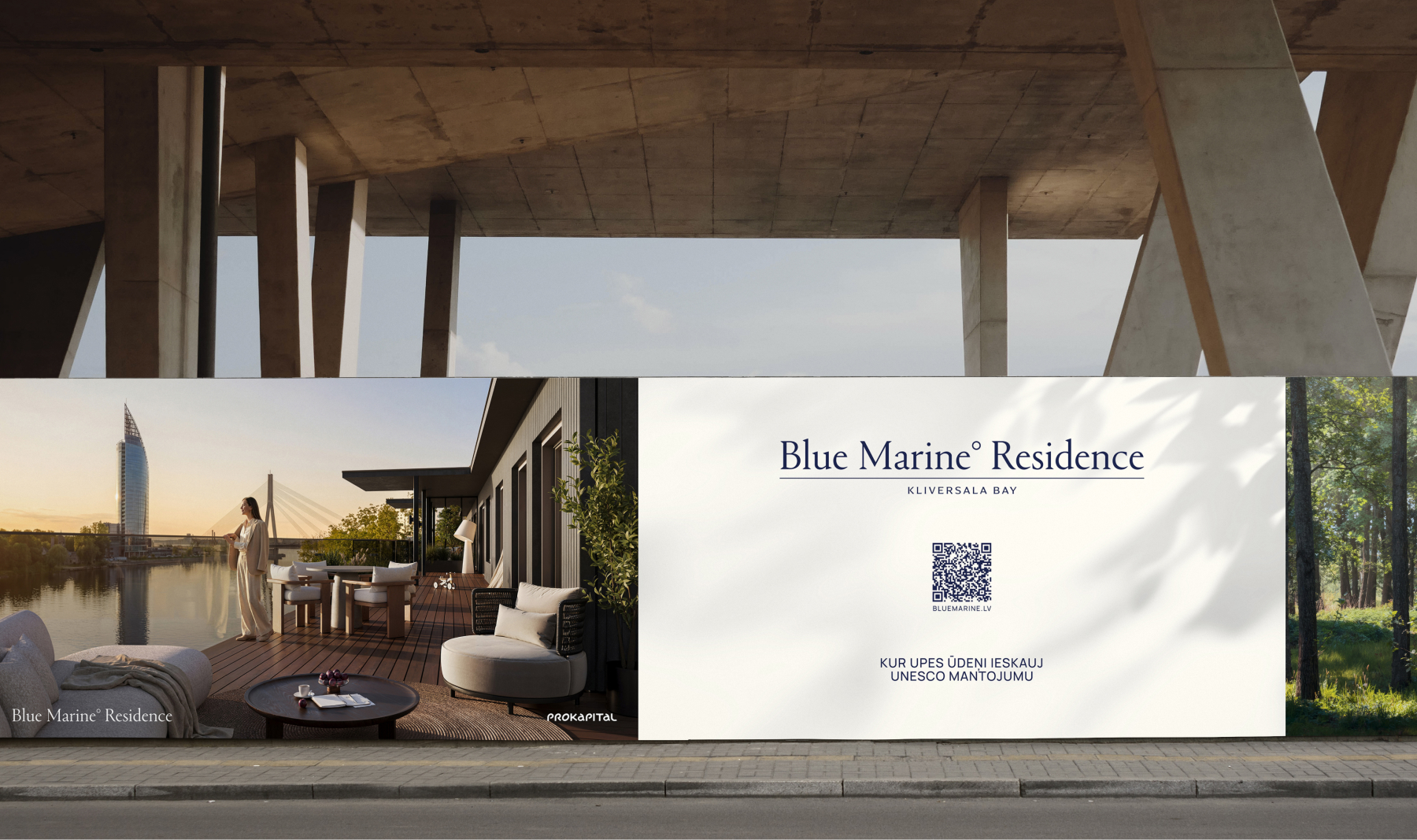
The Kliversala Bay logo brings together maritime heritage and contemporary design. Refined typography is paired with distinctive letterforms, while the coordinates connect the identity to navigation and anchor it to the exact location of Klīversala Bay.
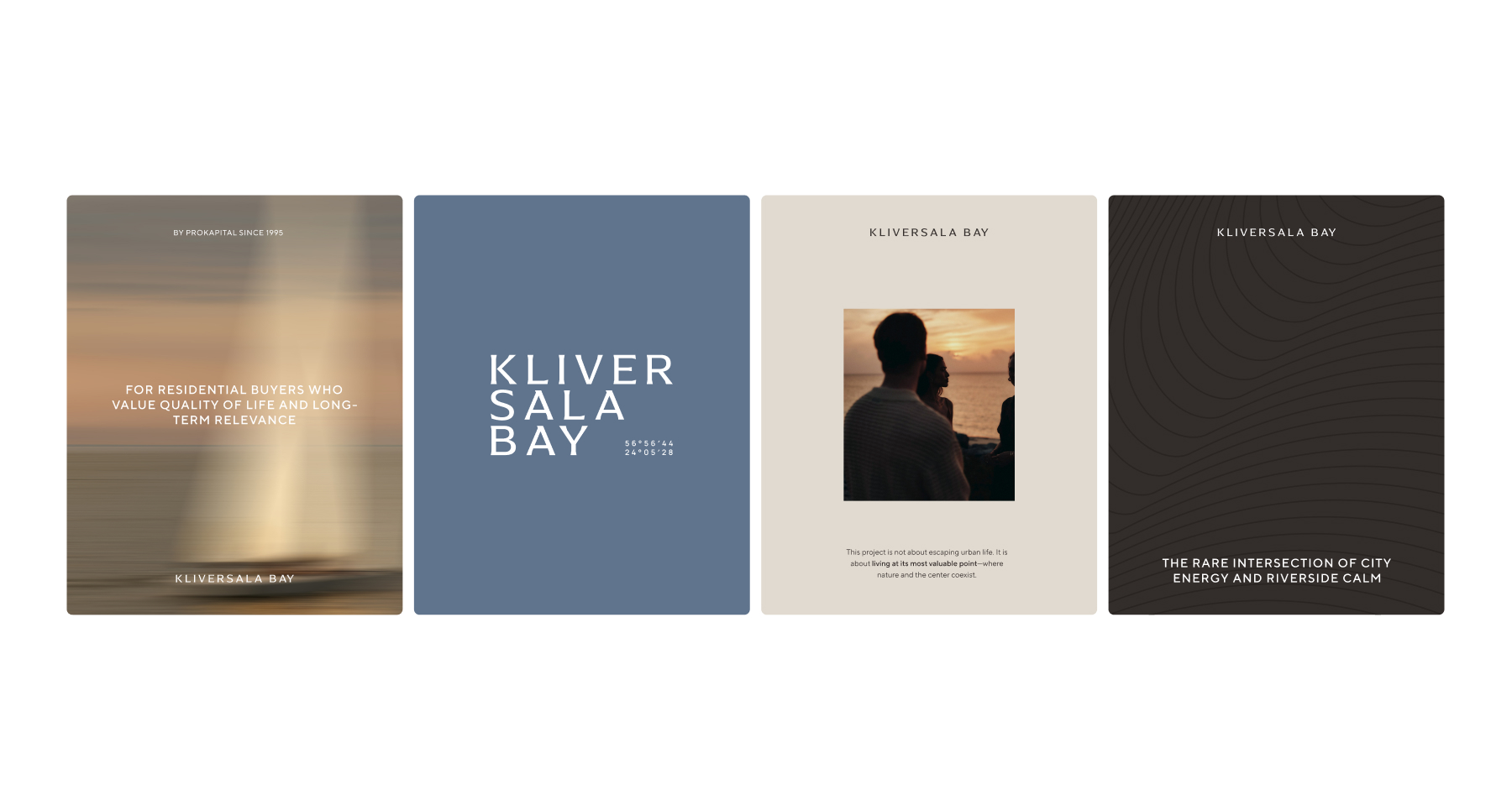
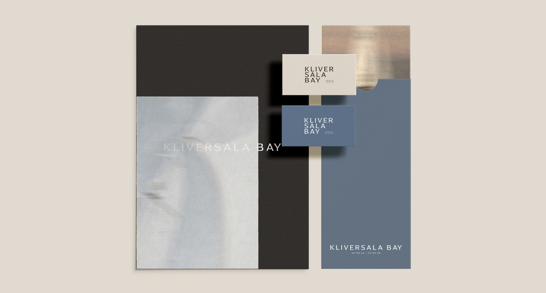
A flexible system of logo variations allows the identity to adapt across formats, from the primary wordmark to more compact and expressive applications.
System
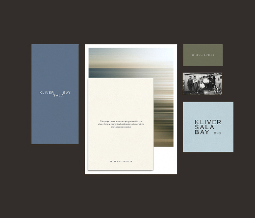
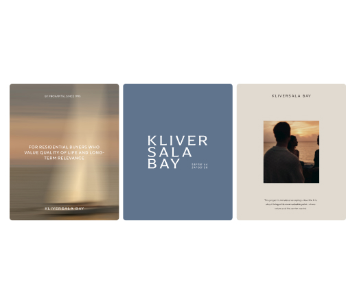
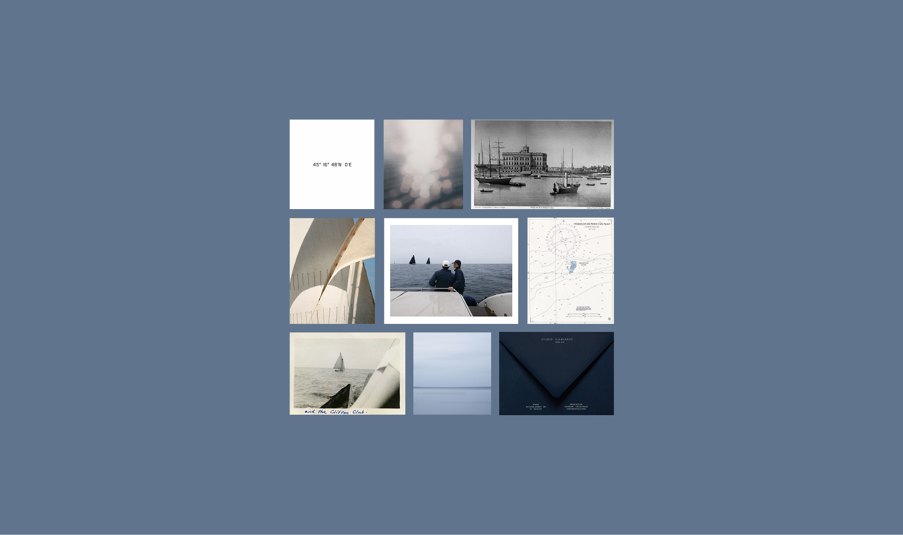
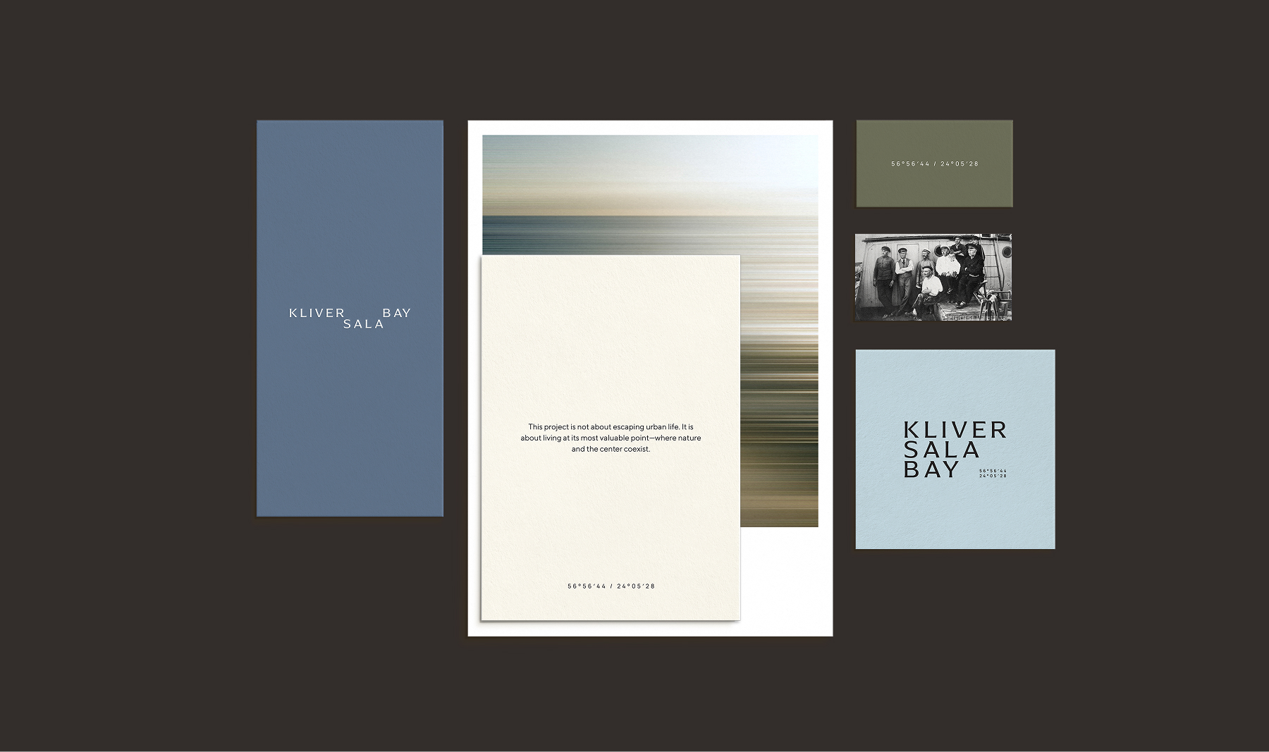
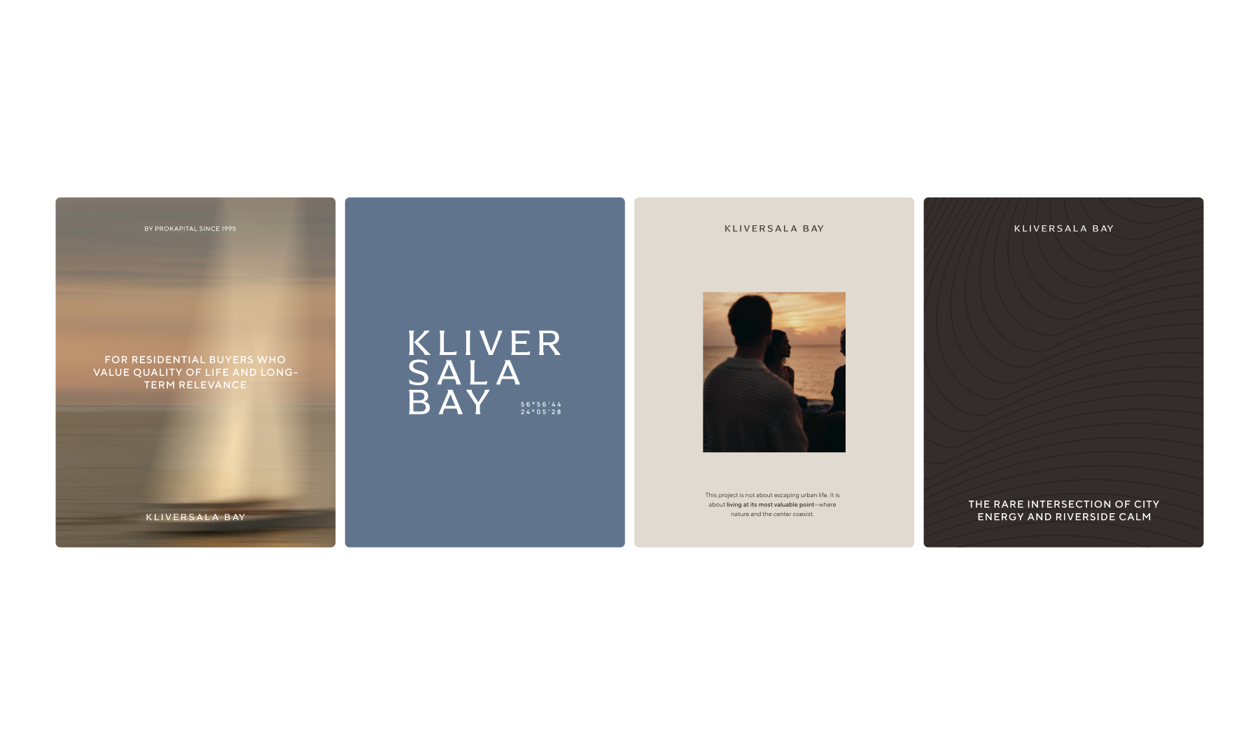
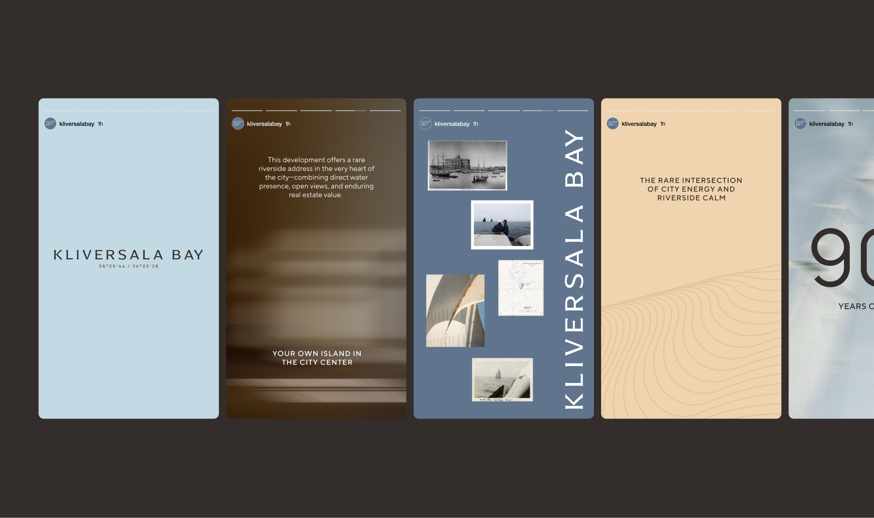
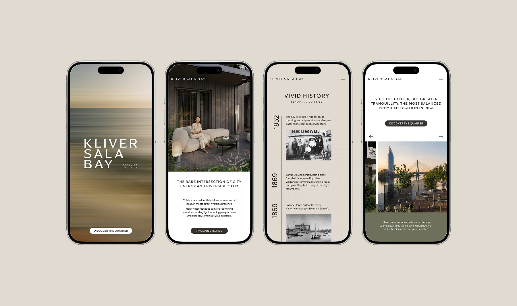
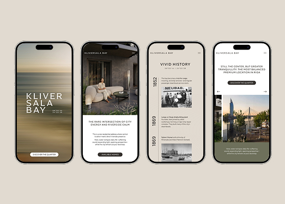
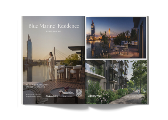
The visual system extends the themes of sailing, open water and quiet natural balance. A soft palette of natural tones is paired with restrained typography subtly inspired by nautical charts.
A line-based pattern traces the outline of Klīversala, referencing waves, historical engravings and cartography. Selected imagery is gently blurred along the horizontal axis, introducing a sense of movement, air and an emphasized horizon.
Riga 2026
Riga 2027


Riga 2026
Riga 2025
Riga 2026